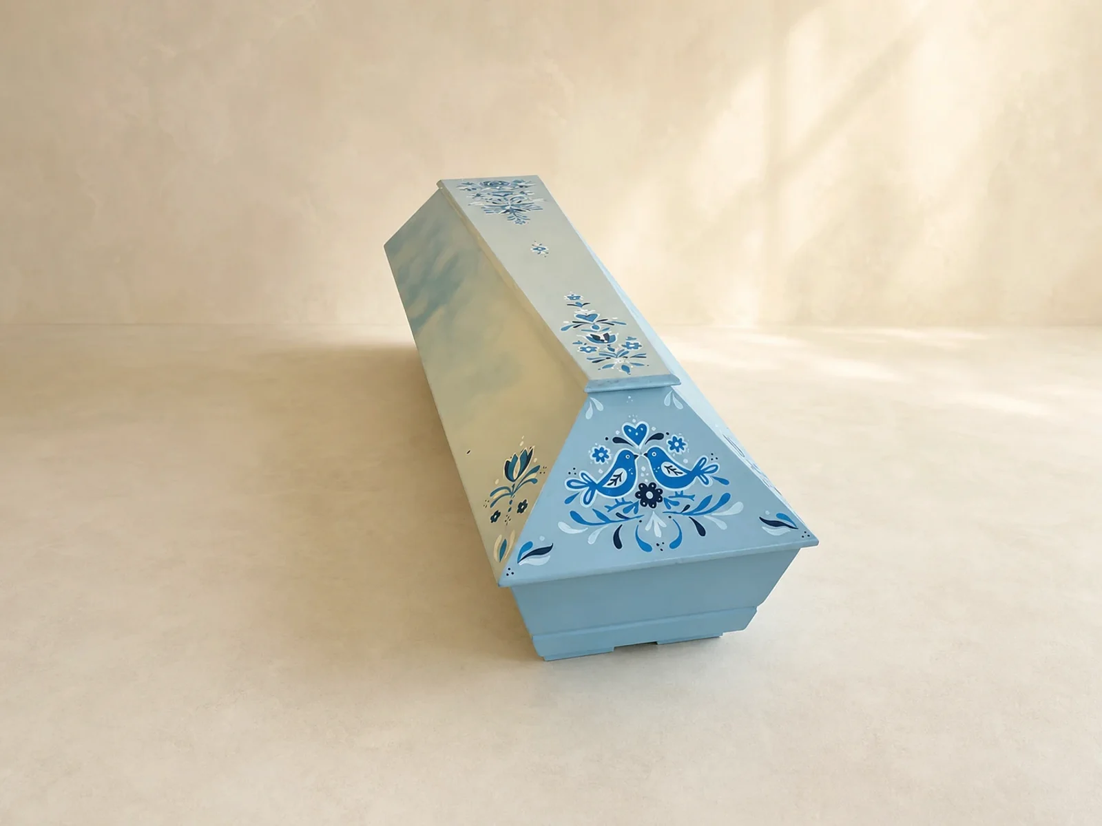
We often associate muted tones with sadness. However, color does not have to deny pain or turn parting into something cheerful. It can only return to the space an element that belonged to the person: the shade of his clothes, flowers from the garden or the pattern of the region from which he came.
Color should be personal, not necessarily symbolic
General interpretations of colors can be interesting, but they are not decisive when parting. Blue may not mean calm for everyone, and yellow may not automatically mean joy. What is more important is what kind of memory they actually open in the family.
Photos of the home, favorite clothes, a picture on the wall or the colors of the garden are good inspirations. They can be used to create a palette that looks natural and at the same time matches the flowers and the shape of the ceremony hall.
Subtlety does not exclude expression
Someone wants only tone in tone and a small drawing. To another belongs deep red, blue print or solar yellow. Both can be worthy. The measure, composition and harmony with the person's personality are decisive, not the intensity of the shade itself.
Color doesn't have to diminish sadness. He can give it a specific name, place and memory.
A traditional pattern can connect several generations
An ornament, embroidery or blueprint is not just decoration. For the family, they can carry a memory of home, costume, holidays and handiwork. When transferring to a coffin, it is a good idea to simplify the pattern and adapt it to the shape so that it does not lose its rhythm and does not look like a mechanically transferred print.
The decision can be very small
If the idea of a colored coffin is too strong, you can start with a subtle detail: a branch, a line, a bird or a stripe of your favorite color. The personal form of farewell is not a competition in originality. It is to help the family know that they are saying goodbye to their loved one.